Brighton Science
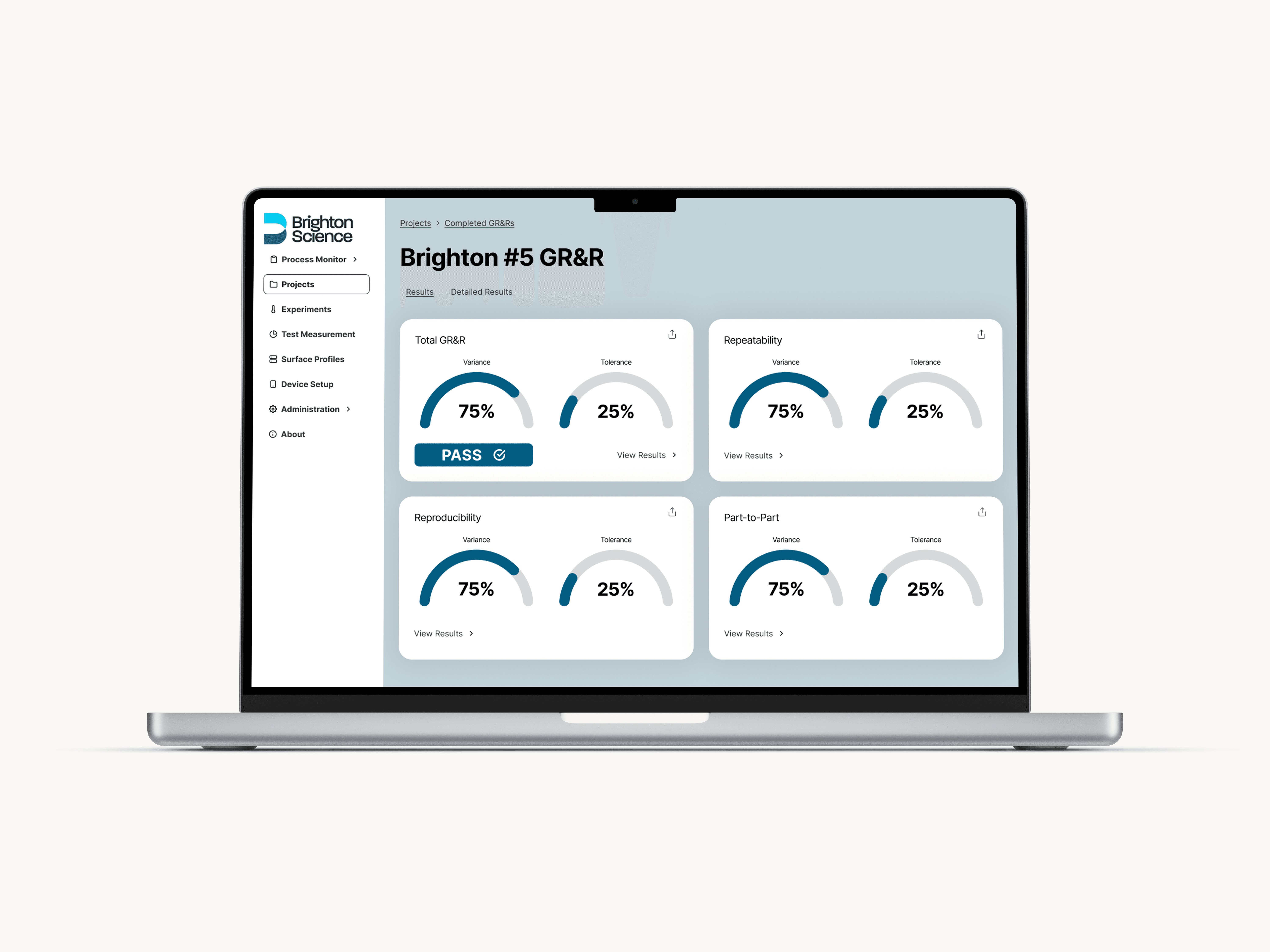
Designed a dashboard for Brighton Science, allowing users to view the results of GR&R tests.
Designed a dashboard for Brighton Science, allowing users to view the results of GR&R tests.
Team
Team
Allie Keith
EJ Makela
Mamoun Alassouli
Matt Collins
Trevor Charon
Allie Keith
EJ Makela
Mamoun Alassouli
Matt Collins
Trevor Charon
Role
Role
User Researcher
UX Designer
UI Designer
User Researcher
UX Designer
UI Designer
Role
User Researcher
Visual Designer
Tools
Tools
Miro
Figma
Canva
Miro
Figma
Canva
Deliverables
Deliverables
Problem
Problem
Problem
Brighton Science needs a dashboard for its BConnect web app to view results from a Gage Repeatability & Reproducibility (GR&R) test.
Brighton Science needs a dashboard for its BConnect web app to view results from a Gage Repeatability & Reproducibility (GR&R) test.
Solution
Solution
Solution
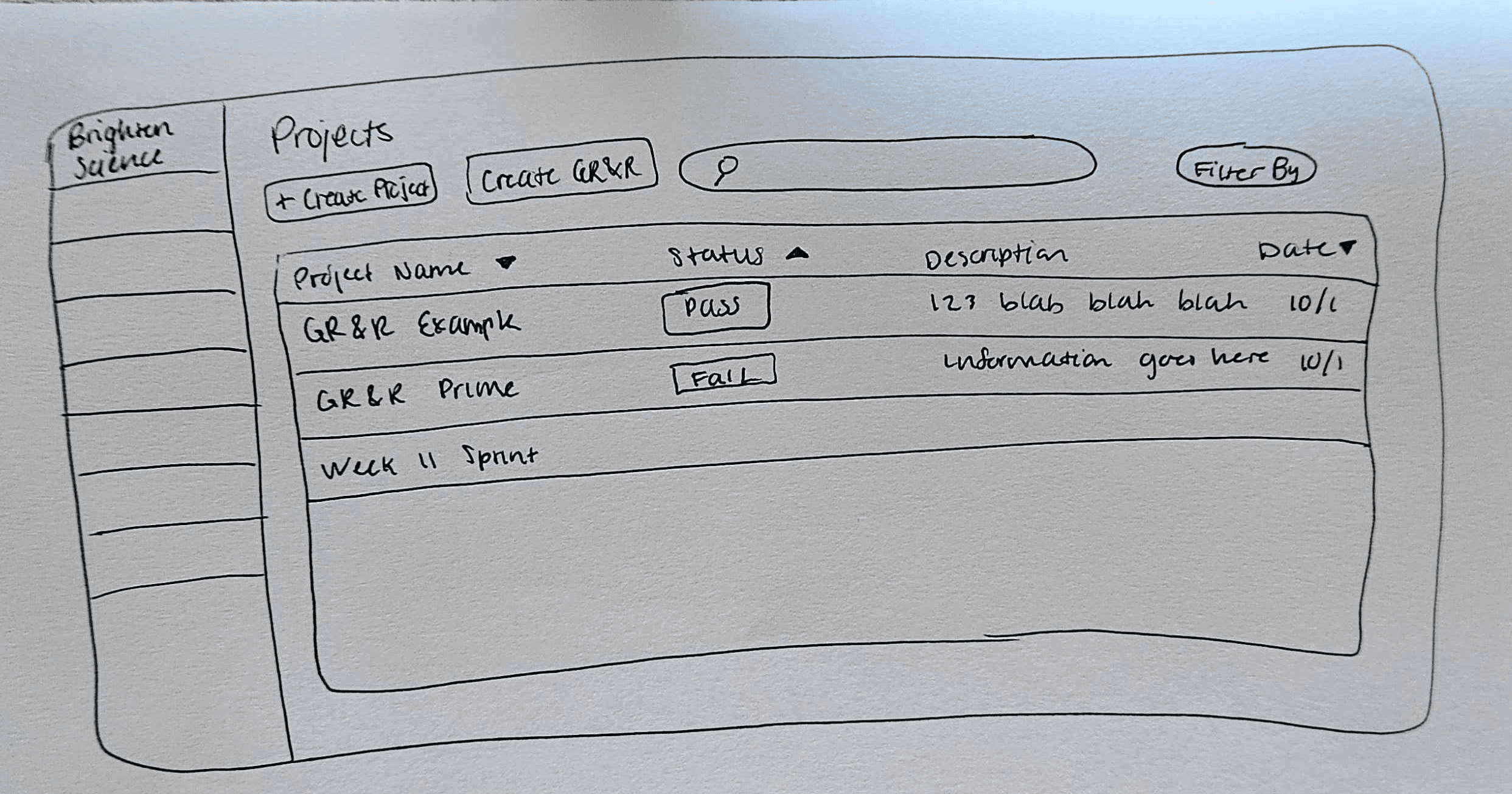
I redesigned and prototyped a dashboard that allows Quality Assurance (QA) managers to view the GR&R results in a clear way, as well as redesigning its "Projects" page to streamline efficiency.
I redesigned and prototyped a dashboard that allows Quality Assurance (QA) managers to view the GR&R results in a clear way, as well as redesigning its "Projects" page to streamline efficiency.
Process
Process
Process
Client Call
In our initial interview with the client, we learned more about the client's goals, its current GR&R process and pain points, and any data regarding its current user experience with the GR&R system.
Client Call Key Findings
Users want the data to show up immediately in the tool dashboard
5 different outputs wanted: repeatability score, reproducibility score, part-to-part score, overall GR&R score, pass/fail
Easy to read, show percentages
Ability to export data
If test fails, able to figure out why
Customer Journey Map
Based on the information from the client, I designed a current customer journey map for a QA manager going through the GR&R process. By doing that, I was able to identify their pain points and how to better enhance their experience with the GR&R test in the future (seen in the future state customer journey map).
Annotated Wireframes
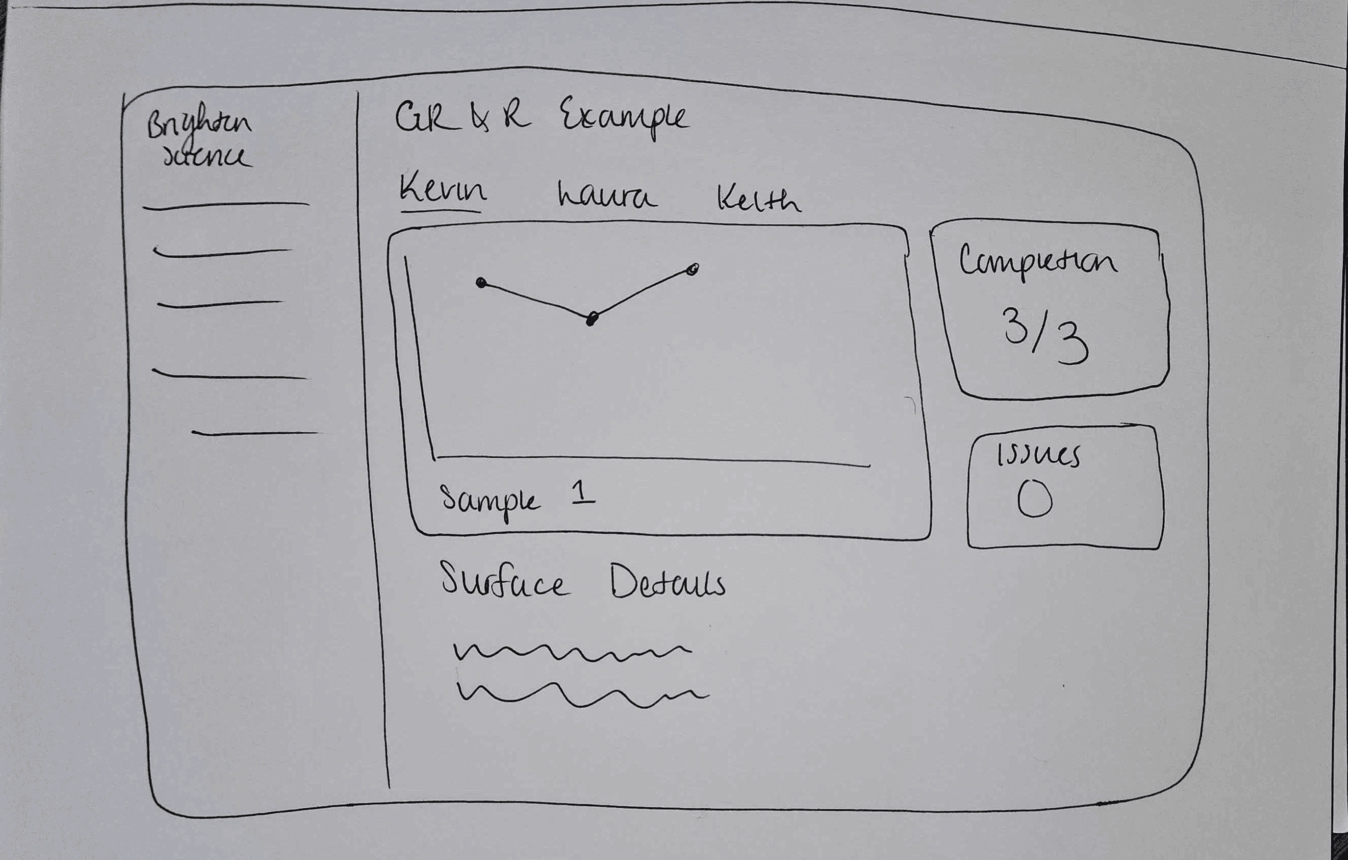
Using the customer journey maps as a reference, I created wireframes for 5 key screens in the dashboard: the updated projects page, 3 different screens for the GR&R results, and one screen showing the share feature.
Prototyping
After building out initial wireframes, I built out 5 screens: the updated projects page, a new page specifically for completed GR&Rs, 2 screens showing the GR&R dashboard, and the page for completed GR&Rs once it updates.
Reflection
Reflection
Reflection
What I Learned
More People = More Ideas
For the design portion of this project, everyone on the team created low fidelity wireframes of the site pages. In turn, we voted on which designs we wanted to prototype based on developers' ability to build out the designs and our own preference. At first, I wasn't the biggest fan of that idea because I wanted to build out my own designs, but after looking at other people's designs I realized there were some good ideas and ideas I hadn't considered. I ended up prototyping someone else's wireframe I voted on, in addition to fusing my ideas with the other people's ideas for another page. I learned it's good to seek inspiration from others and get outside opinions. In the end, my prototypes were even stronger because of it.
For the design portion of this project, everyone on the team created low fidelity wireframes of the site pages. In turn, we voted on which designs we wanted to prototype based on developers' ability to build out the designs and our own preference. At first, I wasn't the biggest fan of that idea because I wanted to build out my own designs, but after looking at other people's designs I realized there were some good ideas and ideas I hadn't considered. I ended up prototyping someone else's wireframe I voted on, in addition to fusing my ideas with the other people's ideas for another page. I learned it's good to seek inspiration from others and get outside opinions. In the end, my prototypes were even stronger because of it.
Next Steps
Complete Prototyping the Mobile Version
I had extra time on my hands, so I designed low to mid fidelity wireframes of the dashboard for mobile as well. While the the wireframes were fine, the interactive prototype I built wasn't my best. I know there were some glitches that I didn't have time to fix, so with more time I would build out a more robust version of the interactive prototype.
I had extra time on my hands, so I designed low to mid fidelity wireframes of the dashboard for mobile as well. While the the wireframes were fine, the interactive prototype I built wasn't my best. I know there were some glitches that I didn't have time to fix, so with more time I would build out a more robust version of the interactive prototype.
Constraints
Complex Technology to Understand In Limited Time
The technology Brighton Science has developed is very technical and complex to understand. It involves a tool, the Surface Analyzer, that measures angles of water droplets on surfaces. Our task was to build a dashboard that shows the results of a test that measures the accuracy of the Surface Analyzer in order to see if the Surface Analyzer is working properly. That test outputs a bunch of data including p-values, tolerance levels, and other data that is very complex to understand, and we only had two days to absorb that information. While the data Brighton Science desired for the main page of the dashboard was known, it was unknown what other information beyond that they'd want to see. So when I created a more in depth prototype, I wasn't 100% sure what data and/or charts to include. I made an educated guess based on what information I saw on a spreadsheet that was provided.
The technology Brighton Science has developed is very technical and complex to understand. It involves a tool, the Surface Analyzer, that measures angles of water droplets on surfaces. Our task was to build a dashboard that shows the results of a test that measures the accuracy of the Surface Analyzer in order to see if the Surface Analyzer is working properly. That test outputs a bunch of data including p-values, tolerance levels, and other data that is very complex to understand, and we only had two days to absorb that information. While the data Brighton Science desired for the main page of the dashboard was known, it was unknown what other information beyond that they'd want to see. So when I created a more in depth prototype, I wasn't 100% sure what data and/or charts to include. I made an educated guess based on what information I saw on a spreadsheet that was provided.

