St. Paul Public Works Website
Helping users find information around recycling and garbage faster and more efficiently
Helping users find information around recycling and garbage faster and more efficiently
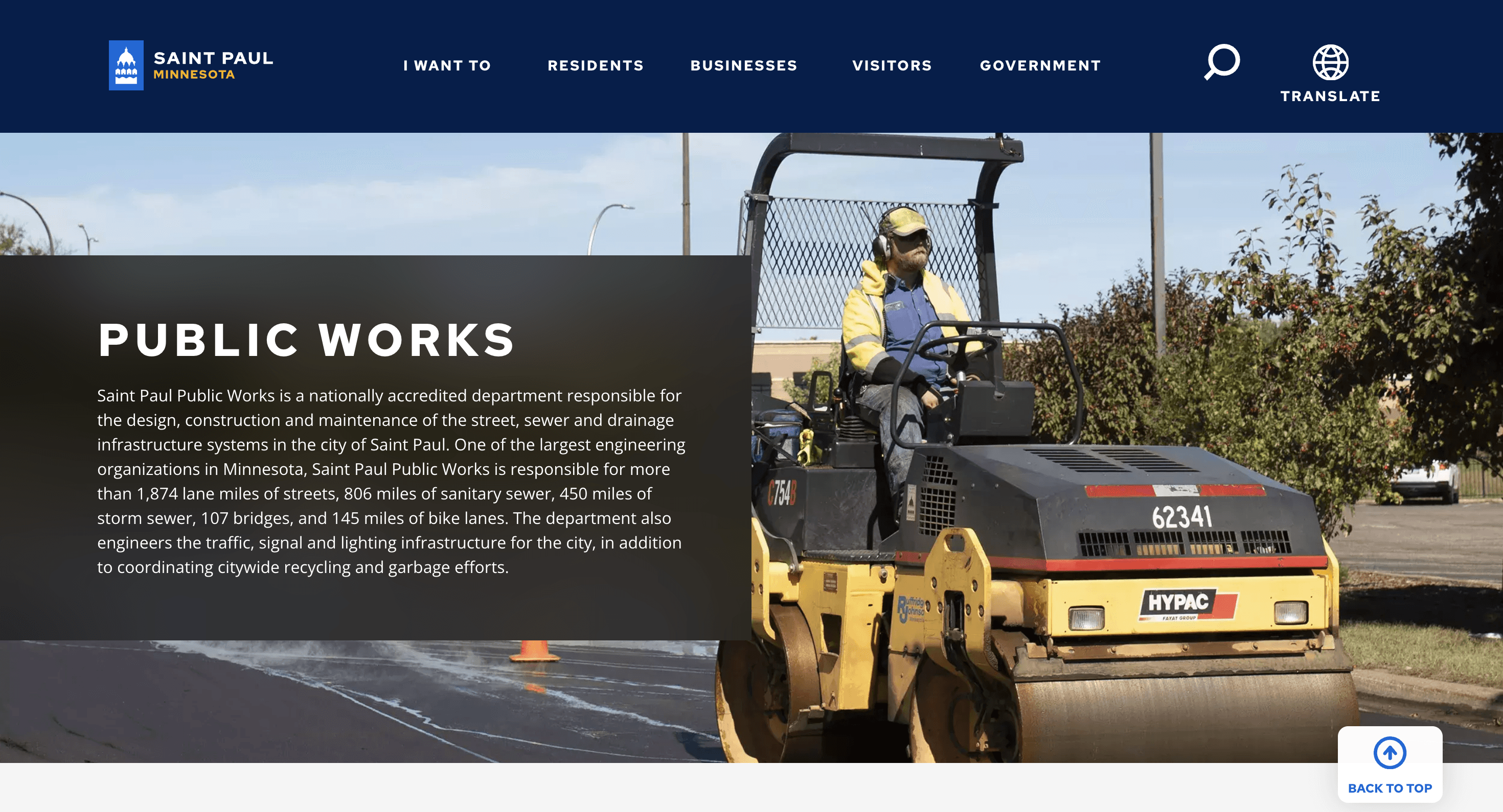


The old version of the St. Paul Public Works site before our recommendations
Team
Team
Allie Keith
Ayantu Gamtessa
Damian Wojtowicz
EJ Makela
Megan Westerlund
Allie Keith
Ayantu Gamtessa
Damian Wojtowicz
EJ Makela
Megan Westerlund
Role
Role
User Researcher
Moderator
User Researcher
Moderator
Role
User Researcher
Visual Designer
Deliverables
Deliverables
Problem
Problem
Problem
St. Paul's Public Works (SPPW) current site is difficult for users to find recycling and garbage information, which are its most popular pages. The SPPW department knows it's difficult and wants to understand how its primary users navigate the existing site in order to better optimize it.
After conducting a heuristic analysis of the current site based on the Nielsen Norman heuristics and scale, we noticed violations of 4 primary heuristics: aesthetic and minimal design, help and documentation, consistency and standards, and visibility of system status. These violations worked together to create an unpleasant user experience, which was further proven by our research.
Solution
Solution
Solution
To test the usability of the site and identify specific pain points, 5 participants were tasked with finding information on 4 common recycling and garbage-related topics. Of the 4 tasks, only 1 was fully completed by all participants, with the remaining tasks each having their respective difficulties. Task 3 was completed by 4/5 participants, task 2 trailed behind with a completion rate of 3/5, and finally task 4 only saw a 1/5 completion rate.
From these test results, 4 broad recommendations were made that will enhance the usability of the site:
Cut unnecessary content out; put the most relevant information users want up at the top so they can click on it immediately, especially on the homepage
Reword text (and button text) to directly address user’s questions
Restructure homepage with recycling and garbage as the main priorities, and reduce less relevant sections
Include breadcrumbs on page, so people can easily navigate back
Process
Process
Process
Initial Research
This project came with some research and data collected by the St. Paul Public Works department. Their data showed the most visited pages in the recycling section and in the garbage section. City-wide drop-off events, the collection schedule, and yard waste and composting were the most visited under recycling, and residential garbage, bulky item collection, and garbage rates were among the most visited by residents under garbage. Based on that information, we had an idea of where to begin.
As a team, we then tested the website's usability by completing 10 tasks related to recycling and garbage using the think-aloud protocol as we went. We found many of the tasks challenging to complete, and some we were unable to complete. Further analyzing our results, we conducted a heuristic analysis of the website based on the Nielsen Norman heuristics and noticed violations of primarily 4 heuristics: aesthetic and minimal design, help and documentation, consistency and standards, and visibility of system status, in addition to visual and hierarchy issues throughout.
Key Findings
Here's a breakdown of our heuristic analysis:
Aesthetic and Minimalist Design
Unable to complete task due to the confusing nature of the website
Multiple pages of the website are overloaded with irrelevant information, creating an overwhelming and difficult-to-navigate experience for a user
Help and Documentation
The site does not provide user help to navigate
Every page the user clicked on led to confusion, yet no resources were available to him that would help guide him through the process. Resorted to using the search bar when lost due to no other help functions
Consistency and Standards
Inconsistent Text - user noticed that under the additional resources section were 4 downloadable pdfs, but two didn’t have the pdf symbols next to them unlike the first two, so he was unsure if they contained pdfs or not
Inconsistent Experience - some pages had good site structure, according to the user, but others were difficult to navigate
Visibility of System Status
User did not know which link from the homepage brought him to a plastic bag graphic he found
User also had to navigate back to homepage multiple times, and there was no one-click way to do that besides hit the back arrow multiple times
Usability Testing
To further test the usability of the St. Paul Public Works site, we interviewed 5 community members that were part of the primary user group in order to
Better understand how a user navigates the public works section to find information regarding garbage and recycling disposal
Gain insights and feedback around how users feel and the ease of use while navigating garbage/recycling pages
Identify roadblocks/hurdles that users experience when trying to leverage services for their waste collection
We had users complete 4 tasks by themselves using the think-aloud protocol in order to hear their honest thoughts and feelings. Participants had to 1) find what items are acceptable for recycling, 2) find how to dispose of a couch, 3) find the garbage pickup day for a certain address, and 4) find a community recycling event.
Key Findings
Only 1 of 5 participants were able to complete all 4 tasks. Cassie, the second participant, was only able to complete tasks 1 and 3. Connor completed the first 3, but task 2 and 3 took him a while to figure out. Forrest was only able to complete task 1 and got so stuck on task 2 that he didn't have time to finish any of the remaining tasks. The last participant, Rachel, completed the first 2 tasks with ease, but struggled on task 3, leaving task 4 up in the air.
The results were telling: people struggled navigating through the website completing common tasks. It also revealed 4 main overarching issues that nearly aligned with our heuristic analysis:
Information overload: there is way too much information specifically on the SPPW homepage, but many other pages have overwhelming amounts of information
Poorly worded sections and buttons left people confused and unsure how to proceed in some tasks
Content could be prioritized better for the user: page content isn't ordered in a way that prioritizes what users are most interested in (garbage and recycling)
Recommendations
Based on those issues, 4 broad recommendations were made that will enhance the usability of the site:
Cut unnecessary content out; put the most relevant information users want up at the top so they can click on it immediately, especially on the homepage
Reword text (and button text) to directly address user’s questions
Restructure homepage with recycling and garbage as the main priorities, and reduce less relevant sections
Include breadcrumbs on page, so people can easily navigate back
See more detailed page-specific recommendations in the Findings + Recommendations Report below.
"“That’s confusing. That doesn’t make inherent sense to me.”
"“That’s confusing. That doesn’t make inherent sense to me.”
"“That’s confusing. That doesn’t make inherent sense to me.”
Cassie, research participant, in response to completing task 2 on the SPPW site
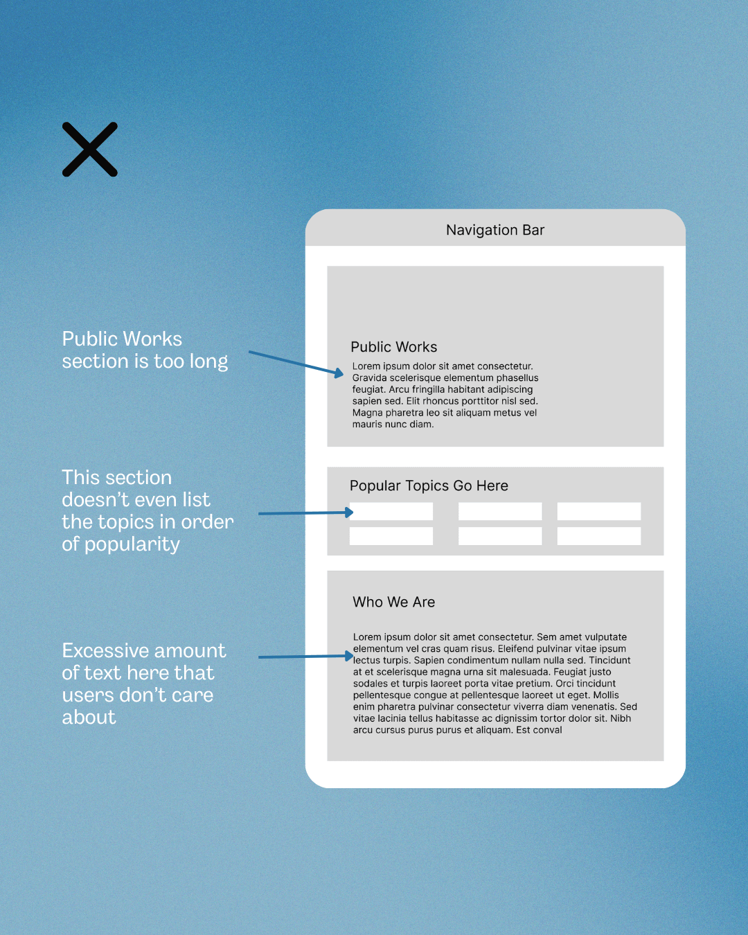


Current Homepage Layout
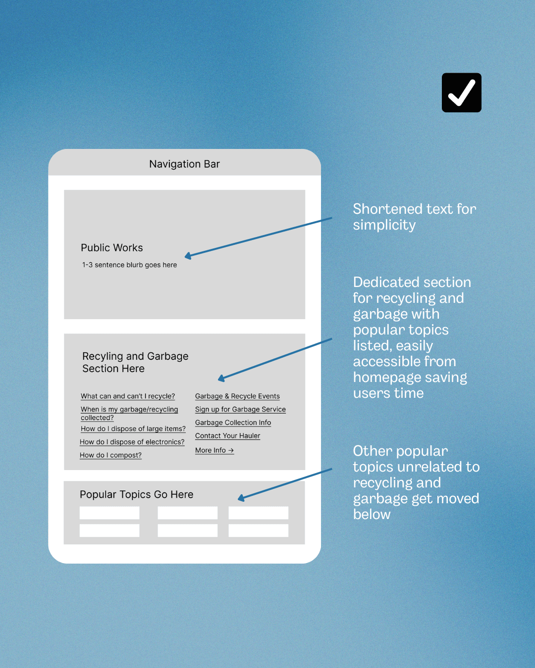


Proposed Homepage Layout
Reflection
Reflection
Reflection
What I Learned
Consider More Factors
After conducting the interviews for usability testing, I realized there were some factors we hadn't considered. For example, we had participants complete every task starting from the SPPW homepage, which isn't necessarily realistic. When looking for how to dispose of, say, a couch, most people would probably google that exact question along with their city. If I Google "how to dispose of a couch St. Paul" that pulls up a few pages from SPPW's website based on SEO (search engine optimization), with Bulky Item Collection being the top result. An average user would probably click on that page, which, from navigating the site many times, I know holds the answer. Therefore, there's a possibility that many users would never even have to navigate through the Public Works site at all, yet we tested people on their ability to.
After conducting the interviews for usability testing, I realized there were some factors we hadn't considered. For example, we had participants complete every task starting from the SPPW homepage, which isn't necessarily realistic. When looking for how to dispose of, say, a couch, most people would probably google that exact question along with their city. If I Google "how to dispose of a couch St. Paul" that pulls up a few pages from SPPW's website based on SEO (search engine optimization), with Bulky Item Collection being the top result. An average user would probably click on that page, which, from navigating the site many times, I know holds the answer. Therefore, there's a possibility that many users would never even have to navigate through the Public Works site at all, yet we tested people on their ability to.
Next Steps
Build Recommendations + Prototypes
We had less than 24 hours to synthesize the interview data and then create our findings and recommendations report, so I didn't have time to build multiple wireframes and mockups that showed my specific recommendations. My next step would be to build out in-depth prototypes that show my exact recommendations.
We had less than 24 hours to synthesize the interview data and then create our findings and recommendations report, so I didn't have time to build multiple wireframes and mockups that showed my specific recommendations. My next step would be to build out in-depth prototypes that show my exact recommendations.
Test Recommendations + Prototypes
Given ample time, I would test my prototypes with users. One way I could do this is with A/B testing: users complete the same task using the current website and then again with my prototype. That way I could compare my prototypes to the current website and see which version users had an easier time navigating.
Given ample time, I would test my prototypes with users. One way I could do this is with A/B testing: users complete the same task using the current website and then again with my prototype. That way I could compare my prototypes to the current website and see which version users had an easier time navigating.
Constraints
SPPW's Homepage Is Part of Entire City Site
We specifically worked with the Public Works (PW) department from the City of St. Paul on its website. Because PW is part of the City of St. Paul, the Public Works' site is contained within the entire city's site. This meant that the SPPW homepage wasn't technically the site's homepage. So when research participants completed our tasks without our guidance, multiple of them tried to click the logo in the upper lefthand corner when instructed to navigate back to the PW homepage, which then led them to the City of St. Paul's homepage (not the PW homepage). It was confusing for participants, but unfortunately it wasn't something we were able to fix because the PW department doesn't have its own separate site.
We specifically worked with the Public Works (PW) department from the City of St. Paul on its website. Because PW is part of the City of St. Paul, the Public Works' site is contained within the entire city's site. This meant that the SPPW homepage wasn't technically the site's homepage. So when research participants completed our tasks without our guidance, multiple of them tried to click the logo in the upper lefthand corner when instructed to navigate back to the PW homepage, which then led them to the City of St. Paul's homepage (not the PW homepage). It was confusing for participants, but unfortunately it wasn't something we were able to fix because the PW department doesn't have its own separate site.

