Yum
Yum
Yum
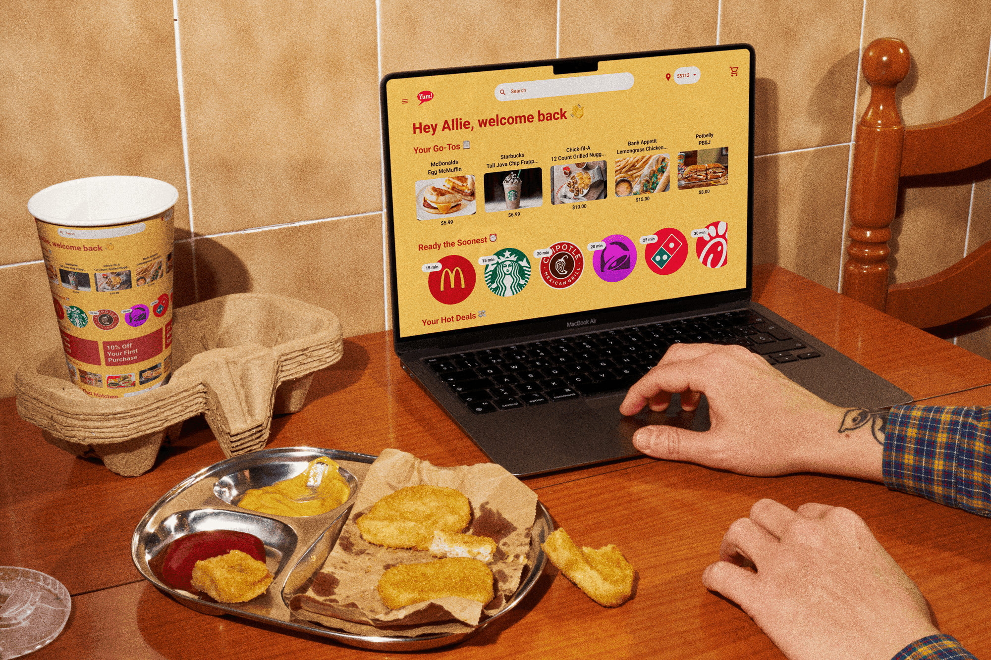
Yum is a fast and speedy food and delivery system, saving people time grocery shopping or cooking.
Yum is a fast and speedy food and delivery system, saving people time grocery shopping or cooking.
Yum is a fast and speedy food and delivery system, saving people time grocery shopping or cooking.


Solo Project
Role
User Researcher
UX Designer
UI Designer
Tools
Figma
FigJam
Canva
Deliverables
Solo Project
Role
Role
User Researcher
UX Designer
UI Designer
Timeline
10 Days
Tools
Tools
Figma
FigJam
Canva
Problem
Problem
Problem
My friend Jack is a busy college student with limited time and money. Like many other young adults, he lives a busy life which leaves him neglecting other aspects of his life such as meals. Food delivery services are a way to solve this problem, but they need to be fast, efficient, and affordable.
After interviewing 5 young adults, the results were conclusive: money and time are highly valued. Throughout the interview, all 5 mentioned money, either the cost of ordering food or looking for cost saving options when ordering. 4 out of 5 mentioned time as a factor in the their purchasing decision.
Solution
Solution
Solution
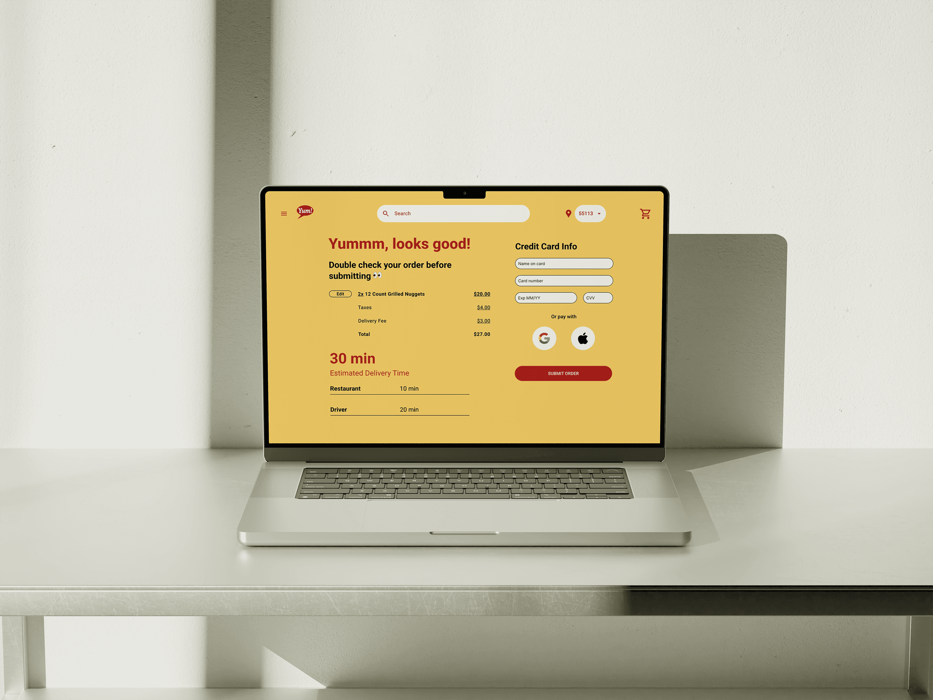
Yum streamlines the online food ordering process by making it simple and fast to checkout and save money.
When testing the prototype, 4 out of 4 participants mentioned how easy the ordering process was. All 4 rated the ease of use an 8/10 or greater, with the average being 9/10.
Yum streamlines the online food ordering process by making it simple and fast to checkout and save money.
When testing the prototype, 4 out of 4 participants mentioned how easy the ordering process was. All 4 rated the ease of use an 8/10 or greater, with the average being 9/10.
Process
Process
Process
Initial Research
I conducted 5 interviews with people who have experience ordering food online to gather insights around the needs and challenges users experience through the online food order and delivery process.
Key Findings
Synthesizing the interview results revealed that cost and time were two of the most prevalent factors when ordering food, with all 5 participants mentioning money, and 4 out of 5 mentioning time as a factor.
Wireframing & Prototyping
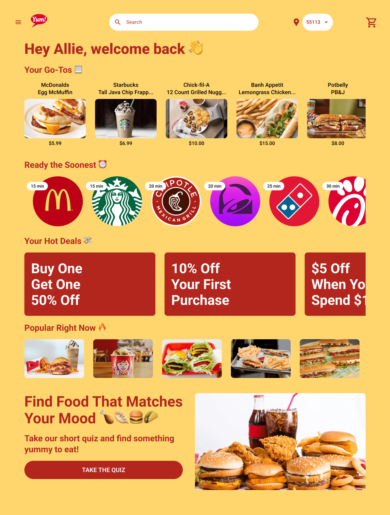
Based on that feedback, I designed a low fidelity wireframe and prototype for a food and delivery website (Yum) that addressed these problems by putting a user's most frequent orders at the top, including a section for the fastest deliveries, and including a section for coupons, plus more.
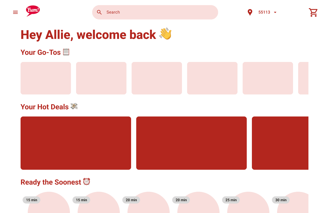


My initial low fidelity wireframe of Yum's homepage
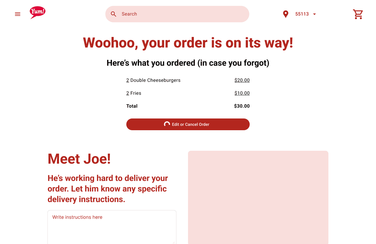


My initial low fidelity wireframe of Yum's order confirmation page
Usability Testing
After building out the prototype, I conducted 4 moderated and scripted interviews showing 4 key screens in order to
Understand the degree to which Yum’s prototype conveys a fast and speedy food delivery system
Gain insights around how users interact with the prototype
Identify opportunities and pain points within the food ordering process
I used the think aloud protocol to unveil participant’s unfiltered thoughts and opinions while navigating the prototype. Check out the prototype for yourself here.
Updated Prototype
Based on participant's feedback, changes were made that further enhanced usability and that prioritized efficiency and clarity of the concepts.
I switched "Ready the Soonest" and "Your Hot Deals" on the homepage, after a participant mentioned that "Ready the Soonest" is what they would prioritize for speed
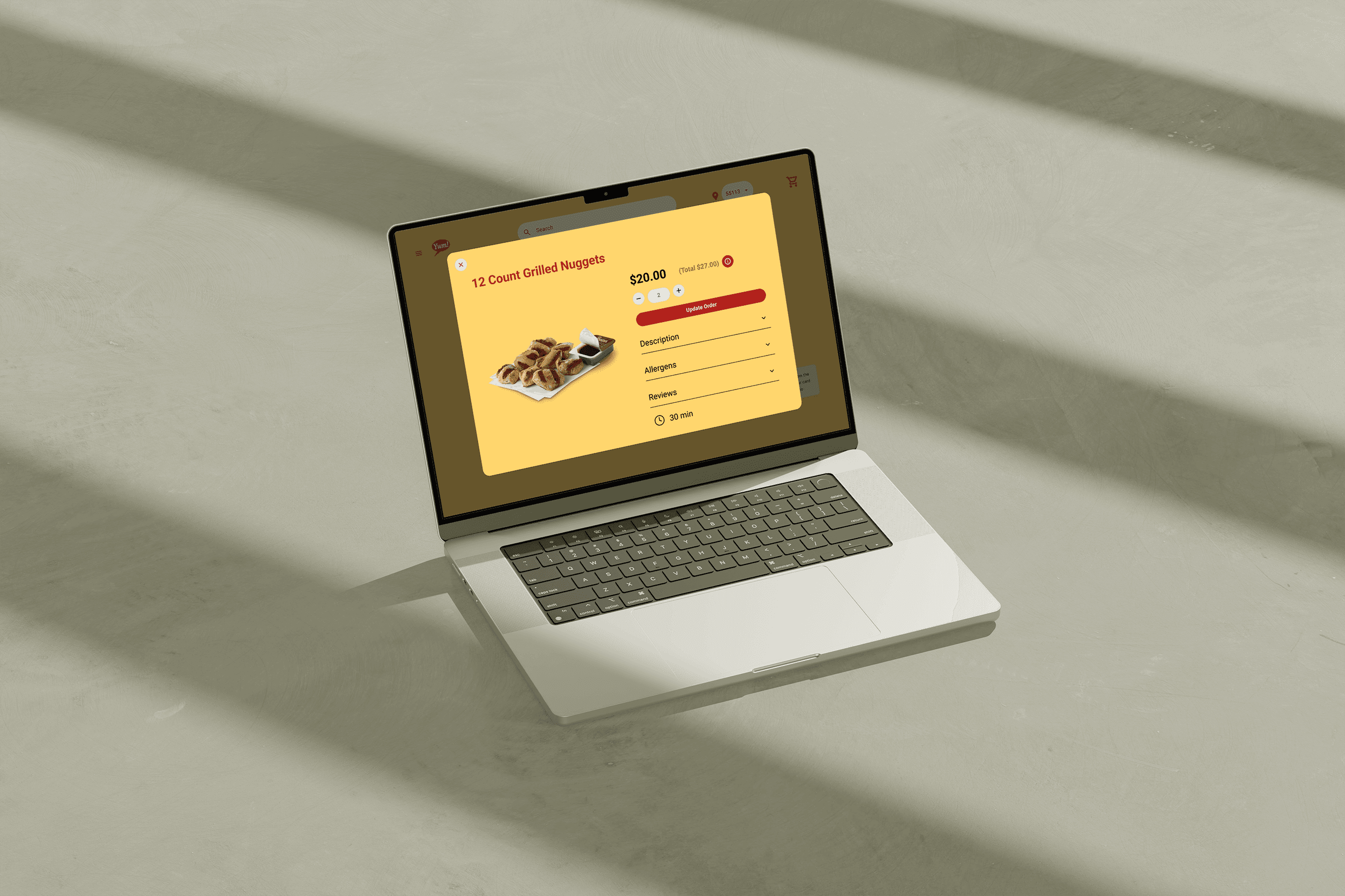
I chose yellow and red as the main color theme because those are often indicative of food and hunger, similar to how McDonald's and other fast food chains use those colors
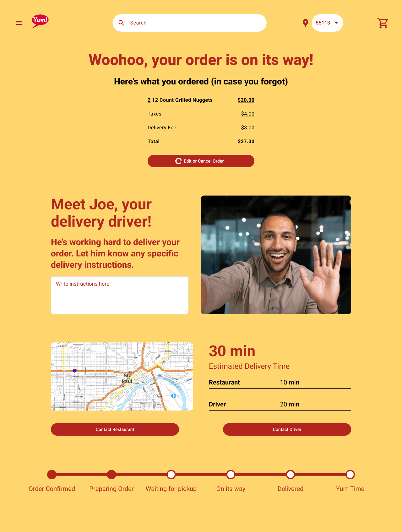
On the order confirmation page, I changed the headline from "Meet Joe!" to "Meet Joe, your delivery driver!" to give context to who Joe is after a participant was initially confused at who that was meant to be


“ Simple. Quick. Personable. ”
“ Simple. Quick. Personable. ”
“ Simple. Quick. Personable. ”
Research Participant




Reflection
Reflection
Reflection
What I Learned
Interview Skills
These being my first UX interviews, it was difficult to be unbiased and not prime participants with leading questions and maintain a neutral stance, especially when I had new ideas I wanted to share with them as they spoke. I also found it difficult to dig deeper when participants gave very short answers.
These being my first UX interviews, it was difficult to be unbiased and not prime participants with leading questions and maintain a neutral stance, especially when I had new ideas I wanted to share with them as they spoke. I also found it difficult to dig deeper when participants gave very short answers.
Next Steps
Build Mobile Version
Most people ordering food on-the-go are likely using their phones, so in the future I would build out the mobile version of Yum.
Most people ordering food on-the-go are likely using their phones, so in the future I would build out the mobile version of Yum.
Restaurant Menus
Because this project had such a constrained timeline, there was a lot I didn't get to flesh out. I'd like to add a page to show each restaurant's menu and what the ordering process looks like from that page.
Because this project had such a constrained timeline, there was a lot I didn't get to flesh out. I'd like to add a page to show each restaurant's menu and what the ordering process looks like from that page.
Food Quiz
In my interviews there was a lot of positive feedback on the Food Quiz I included at the bottom of the home screen. I'd like to finish prototyping that so users can experience it.
In my interviews there was a lot of positive feedback on the Food Quiz I included at the bottom of the home screen. I'd like to finish prototyping that so users can experience it.

