Tinkl
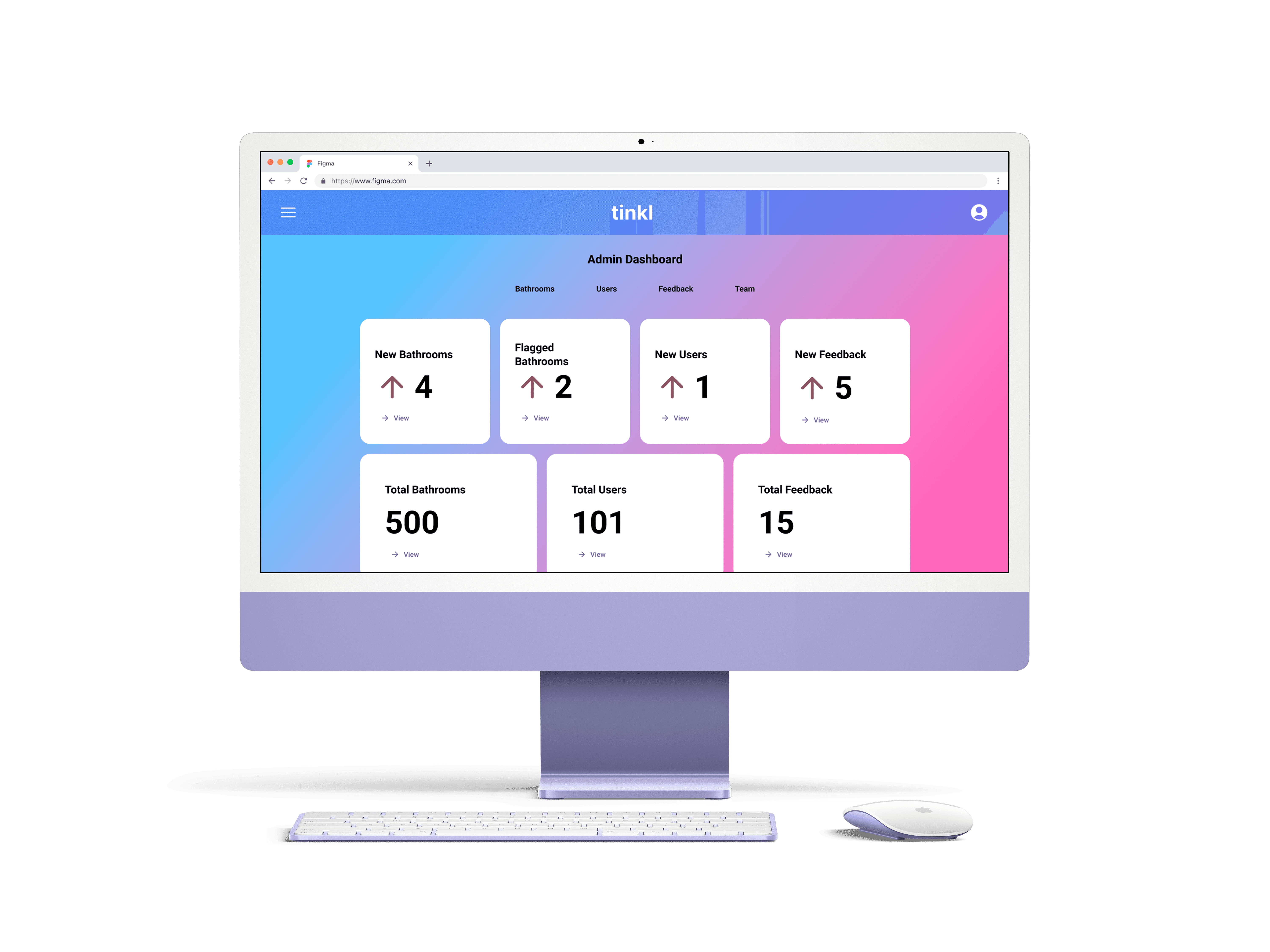
Designed an interactive prototype of an admin dashboard for tinkl, an app helping trans, nonbinary and gender non-conforming people find access to gender-neutral and single-stall bathrooms.
Designed an interactive prototype of an admin dashboard for tinkl, an app helping trans, nonbinary and gender non-conforming people find access to gender-neutral and single-stall bathrooms.
Team
Team
Allie Keith
Chad David Novak
EJ Makela
Lauren Hoerr
Allie Keith
Chad David Novak
EJ Makela
Lauren Hoerr
Role
Role
User Researcher
UX Designer
UI Designer
User Researcher
UX Designer
UI Designer
Role
User Researcher
Visual Designer
Deliverables
Deliverables
Problem
Problem
Problem
Admin don't have a dashboard that allows them to perform key tasks including approving and editing bathrooms, viewing users and user comments, and deleting/disabling user access. Currently, admin have to code that in the backend.
Admin don't have a dashboard that allows them to perform key tasks including approving and editing bathrooms, viewing users and user comments, and deleting/disabling user access. Currently, admin have to code that in the backend.
Solution
Solution
Solution
I built a mockup and interactive prototype of a dashboard that streamlines admin's ability to perform those key tasks. Additionally, with extra time on my hands I redesigned existing user-facing screens, providing more information/context on pages to improve clarity for users. Using design principles such as balance and white space, my redesigns also improved tinkl's overall aesthetic.
I built a mockup and interactive prototype of a dashboard that streamlines admin's ability to perform those key tasks. Additionally, with extra time on my hands I redesigned existing user-facing screens, providing more information/context on pages to improve clarity for users. Using design principles such as balance and white space, my redesigns also improved tinkl's overall aesthetic.
Process
Process
Process
Initial Research
I conducted a cognitive walkthrough based off a hard-coded mockup of the founder, Essie (they/them), operating key admin tasks: approving/editing a bathroom, viewing a user profile, viewing/deleting user *comments (*now referred to as "feedback").
Key Findings
There were difficulties when answering the questions "Will the user recognize the action as the correct one?", and "Is there sufficient and/or appropriate feedback?" in our cognitive walkthrough.
Moderated Interview
Next, we interviewed Essie using the think-aloud protocol in order to
Better understand admins' overall perceptions of the current interface mockup and how it meets their expectations
Uncover the degree to which admin capabilities need to be expanded to meet administrative needs
Gain insights into circumstances in which certain tasks need to be completed, and the capabilities related to those circumstances
Learn more about how well users can complete key tasks
Key Findings
We discovered specific capabilities they were looking for in their dashboard such as being able to complete tasks in bulk (i.e. delete multiple bathrooms, users, etc). Other wishes they mentioned included being able to search for bathrooms, having notification badges, and having popup modals. Most of their wishes could be compiled under the umbrella category of increasing efficiency.
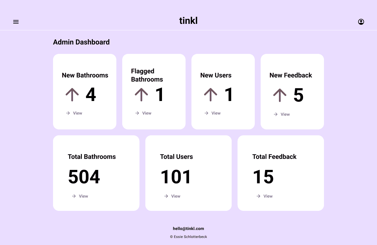

My initial low fidelity wireframe of the admin dashboard
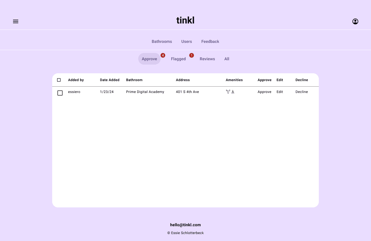

My initial low fidelity wireframe of tinkl's approve bathrooms page
Recommendations
I made the following changes combining Essie's specific wishes, my findings from the cognitive walkthrough, in addition to other pain points I noticed on the current website and Essie's mockup:
Flattened the site's information architecture for admin, allowing admin to easily access all their key tasks right from the homepage when they log in, rather than needing to click the hamburger menu and navigate to the dashboard from there
Changed language to match the real world, citing Nielsen Norman's second heuristic
Any messages that came through the Contact Us page was previously referred to as "comments", which was not to be confused with the "comments" you could leave on a bathroom you visited
Comments left by a user on a specific bathroom are now "Reviews", and any messages coming through the Contact Us page are now "Feedback"
There were a number of other changes I made that also fall under the umbrella category of increasing efficiency for admin
Change the homepage for admin to be the admin dashboard instead of the map, because the map is meant for users trying to locate a bathroom, which isn't a task admin need to do
Added a notification badge to remind and alert admin of new, unread tasks/messages
Added a confirmation popup when admin try to delete anything in order to reduce accidents
And more!
"It would be ideal to have a list of all bathrooms, be able to search bathrooms, and edit it that way."
"It would be ideal to have a list of all bathrooms, be able to search bathrooms, and edit it that way."
"It would be ideal to have a list of all bathrooms, be able to search bathrooms, and edit it that way."
Essie (they/them), tinkl founder
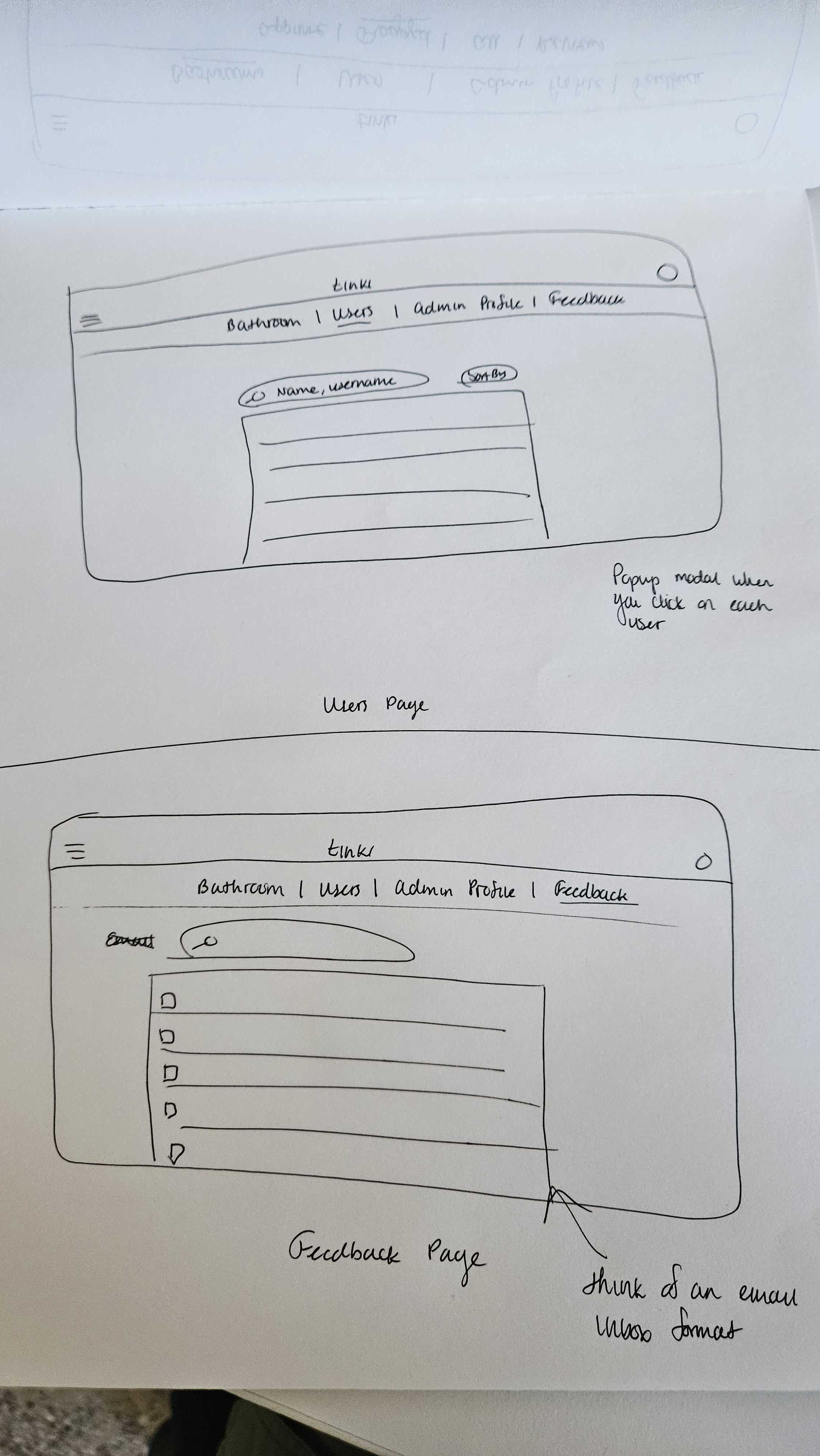


My initial wireframes for the users page and the feedback page
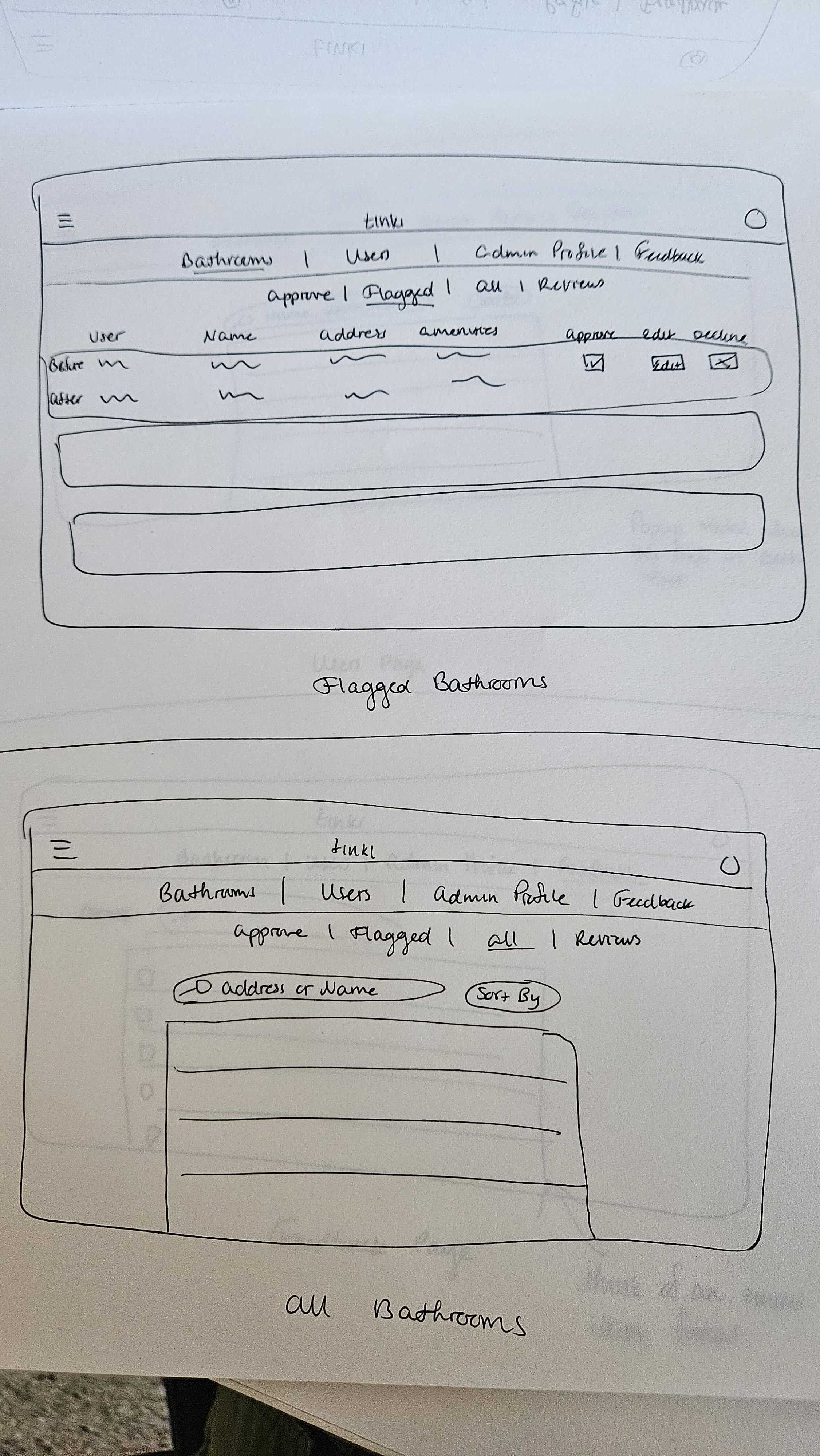


My initial wireframes for the flagged bathrooms page and all bathrooms
Reflection
Reflection
Reflection
What I Learned
Be Prepared for the Unexpected
Sometimes when you conduct research, it doesn't always go as planned. To start, a fully functioning admin dashboard didn't exist, so my team only had a video of an admin dashboard mockup to use for our heuristic analysis. Then, when interviewing the founder, we found that our script wasn't substantial enough. When the interviewees answers weren't fully aligning with the questions, we should have guided them back to the original question, or pushed further for explanation as to why they said xyz. Also, our questions could have been written more explicitly in order to decrease the chances of misinterpretation or wandering too far away from the question at hand. Either way, the information provided by the interviewee was enough for me to understand their current pain points in the admin process and address their concerns in my final prototype.
Sometimes when you conduct research, it doesn't always go as planned. To start, a fully functioning admin dashboard didn't exist, so my team only had a video of an admin dashboard mockup to use for our heuristic analysis. Then, when interviewing the founder, we found that our script wasn't substantial enough. When the interviewees answers weren't fully aligning with the questions, we should have guided them back to the original question, or pushed further for explanation as to why they said xyz. Also, our questions could have been written more explicitly in order to decrease the chances of misinterpretation or wandering too far away from the question at hand. Either way, the information provided by the interviewee was enough for me to understand their current pain points in the admin process and address their concerns in my final prototype.
Sometimes when you conduct research, it doesn't always go as planned. To start, a fully functioning admin dashboard didn't exist, so my team only had a video of an admin dashboard mockup to use for our heuristic analysis. Then, when interviewing the founder, we found that our script wasn't substantial enough. When the interviewees answers weren't fully aligning with the questions, we should have guided them back to the original question, or pushed further for explanation as to why they said xyz. Also, our questions could have been written more explicitly in order to decrease the chances of misinterpretation or wandering too far away from the question at hand. Either way, the information provided by the interviewee was enough for me to understand their current pain points in the admin process and address their concerns in my final prototype.
Next Steps
Build Out the Front End
I really enjoyed working on this project and coming up with designs for how the admin dashboard could look and function. While I had the time to create some user-facing website pages, I would enjoy fleshing out even more of the website and seeing what other ideas I could come up with.
I really enjoyed working on this project and coming up with designs for how the admin dashboard could look and function. While I had the time to create some user-facing website pages, I would enjoy fleshing out even more of the website and seeing what other ideas I could come up with.
I really enjoyed working on this project and coming up with designs for how the admin dashboard could look and function. While I had the time to create some user-facing website pages, I would enjoy fleshing out even more of the website and seeing what other ideas I could come up with.
Constraints
No Real Dashboard To Work From
As I mentioned earlier, the dashboard we conducted our heuristic analysis off of didn't fully exist. Essie hard-coded a rough mockup of what one could look like and recorded a video going through it. So as we conducted our heuristic analysis, we weren't able to test out features for ourselves and get our hands on it. We were limited to watching them use certain functions. Despite this constraint, it still gave us something to work off of and pushed us to use our creativity to fill in the blanks.
As I mentioned earlier, the dashboard we conducted our heuristic analysis off of didn't fully exist. Essie hard-coded a rough mockup of what one could look like and recorded a video going through it. So as we conducted our heuristic analysis, we weren't able to test out features for ourselves and get our hands on it. We were limited to watching them use certain functions. Despite this constraint, it still gave us something to work off of and pushed us to use our creativity to fill in the blanks.

